CSN Application
User Experience
User Interface
Overview
Problem summary
CSN is a Swedish government agency that helps students manage financial matters during their education. Following an extensive user study and some market research, the CSN mobile application was deemed outdated both in terms of aesthetics and UI-design, requiring too many clicks to perform actions and having inconsistent icon usage. In order to make it a real compliment to their website, the application needed some love and attention, and we set out to redesign and improve it based on ISO:s and Jordan's definitions of usability.
My role in the project
I was responsible for creating the template and layout of all user tests during the project. I was the head designer of the ‘home’, ‘FAQ’ and ‘used weeks’ pages in the redesign and had the responsibility of creating a usable prototype, inserting transitions, scroll features, button clicks and making sure the prototype worked as intended. Finally, I led multiple interviews and tests in various stages of the project.
Solution summary
A new CSN application prototype was designed around users’ needs with focus on layout, symbols and functions to prioritize clarity and satisfaction when handling sensitive financial information. The interface uses familiar money management features and CSN’s visual identity to ensure trust and consistency across the organisation's platforms. Clear signifiers and guiding text help users understand actions and information and increase overall guessability. The result is a user-centered app that enables tasks to be completed effectively, efficiently, and with confidence.
User feedback
User tests revealed a big increase in accuracy when interpreting the apps functions. For instance, the average number of correctly interpreted symbols in the old design was 2/6, while it was 5/5 in the redesign. Overall time and clicks to perform tasks were greatly reduced, and the redesign scores higher with regards to understanding of complex features.
So, how did we do it?
The project began by performing an HTA (Hierarchical Task Analysis) for all of the app's features, followed by a CW (Cognitive Walkthrough) and PHEA (Predictive Human Error Analysis) for the most frequently used features in the app to theoretically evaluate the user experience. We gained insight into potential interaction issues and the conditions for a successful task completion.
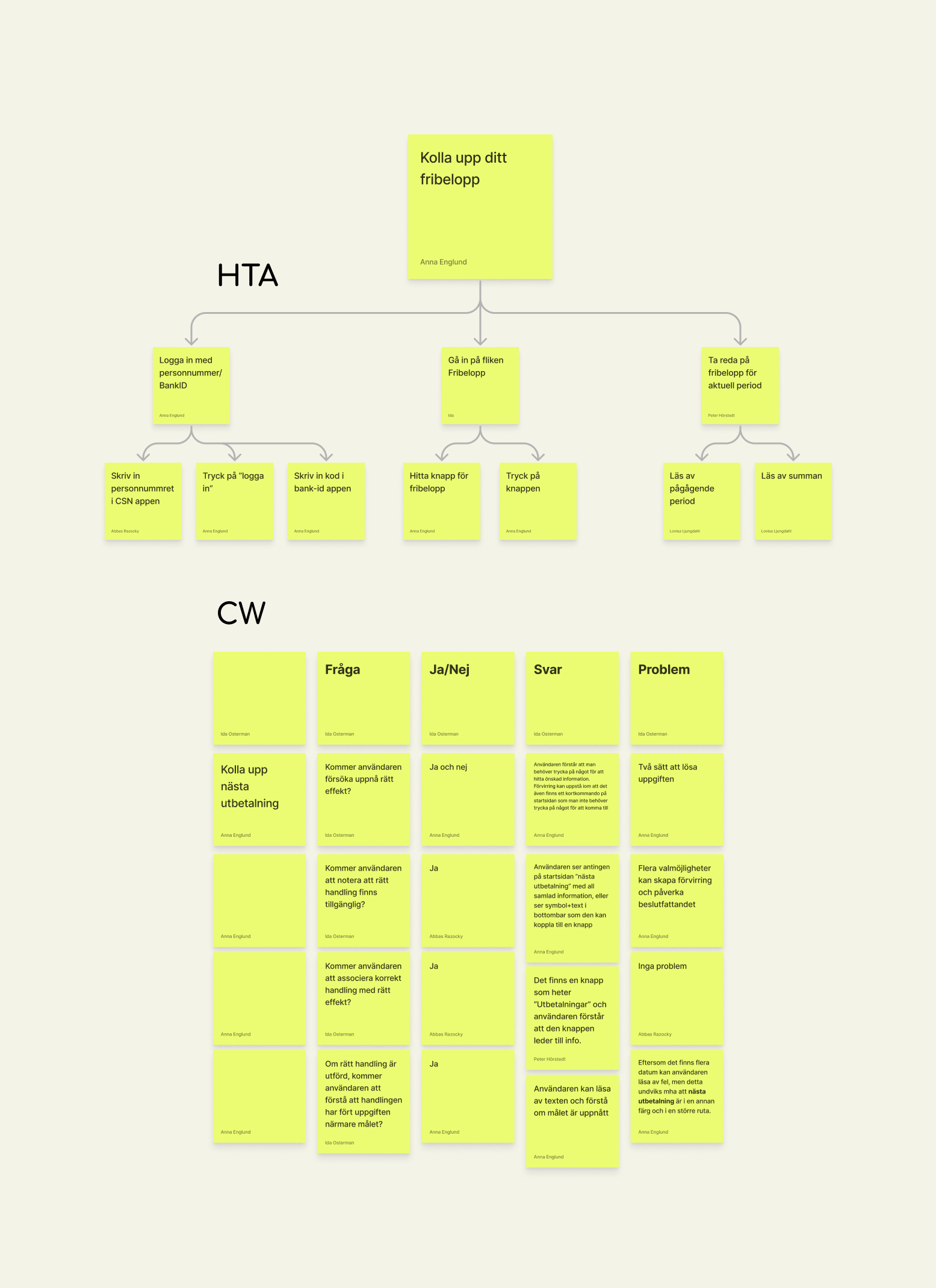
I then conducted user tests and interviews with university students in campus classrooms to replicate the actual usage environment. A representation of the existing app, created in Figma, was used in the tests. Participants were asked to complete six main tasks while “thinking aloud”.
Task completion time, number of clicks and errors made during each task were tracked to study the app's guessability and learnability. The subjective values were gathered through exploring the user's opinions and thoughts through open-ended questions and semantic word scales, allowing us to draw conclusions about the experienced satisfaction.
Ideation, ideation, ideation…
The ideation process produced various concepts that were combined and optimised according to the analysis. Initially, we created wireframes of the concept and further on developed them into a fully functioning high fidelity prototype in Figma. The full redesign is presented below.


NEW
DESIGN
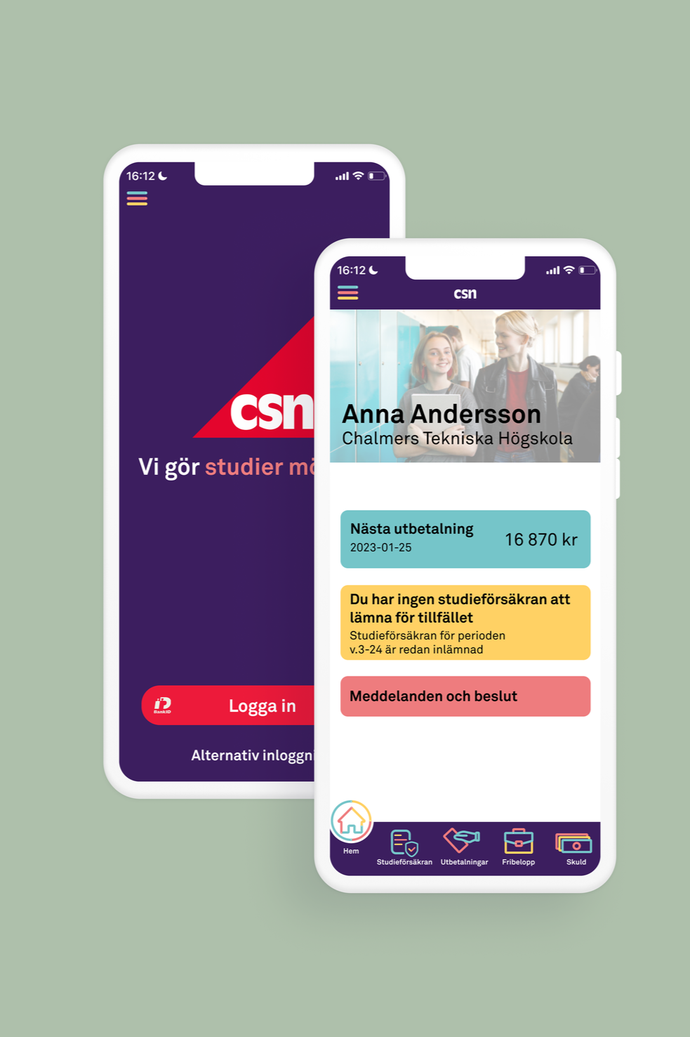
Redesign: Home
-
The app is now structured with a main menu that provides quick access to the most important and frequently used features. A bottom bar is added to facilitate navigation within the app and align with other finance applications.
-
All informational texts have been expanded to provide clearer descriptions of each feature. The active display area has also been enlarged to better suit modern smartphones, giving the interface a more contemporary look.
-
In the initial user test, it became clear that the most frequently used features are submitting the study assurance and checking the next payment. Therefore, these functions are displayed and prioritised in the home tab.

Redesign: Payments
The payments tab largely retains the same functions and information, with prioritisation of the most important elements. The next payment is given prominent space, as it was one of the app's most frequently used features.
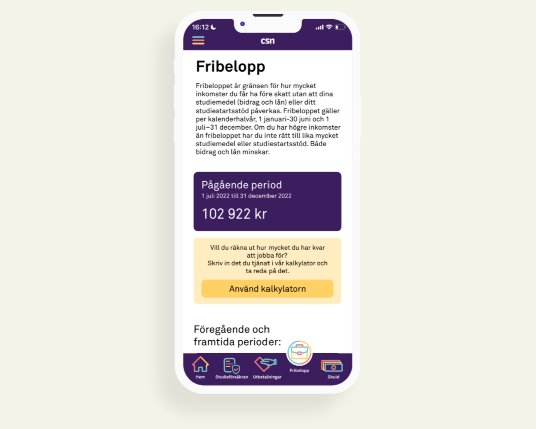
Redesign: Income limit
The main issues related to the "Income Limit" (fribelopp) primarily revolved around the meaning of the term itself. An explanatory text was added as well as a calculator function so that users can calculate how much they have left to earn.

Redesign: Debt
Efficiency remained high in this page, but a difference was seen with regards to satisfaction, particularly through cognitive response, as users’ understanding of the loan breakdown improved. However, misunderstanding of the loan segments appears to be a persistent issue.

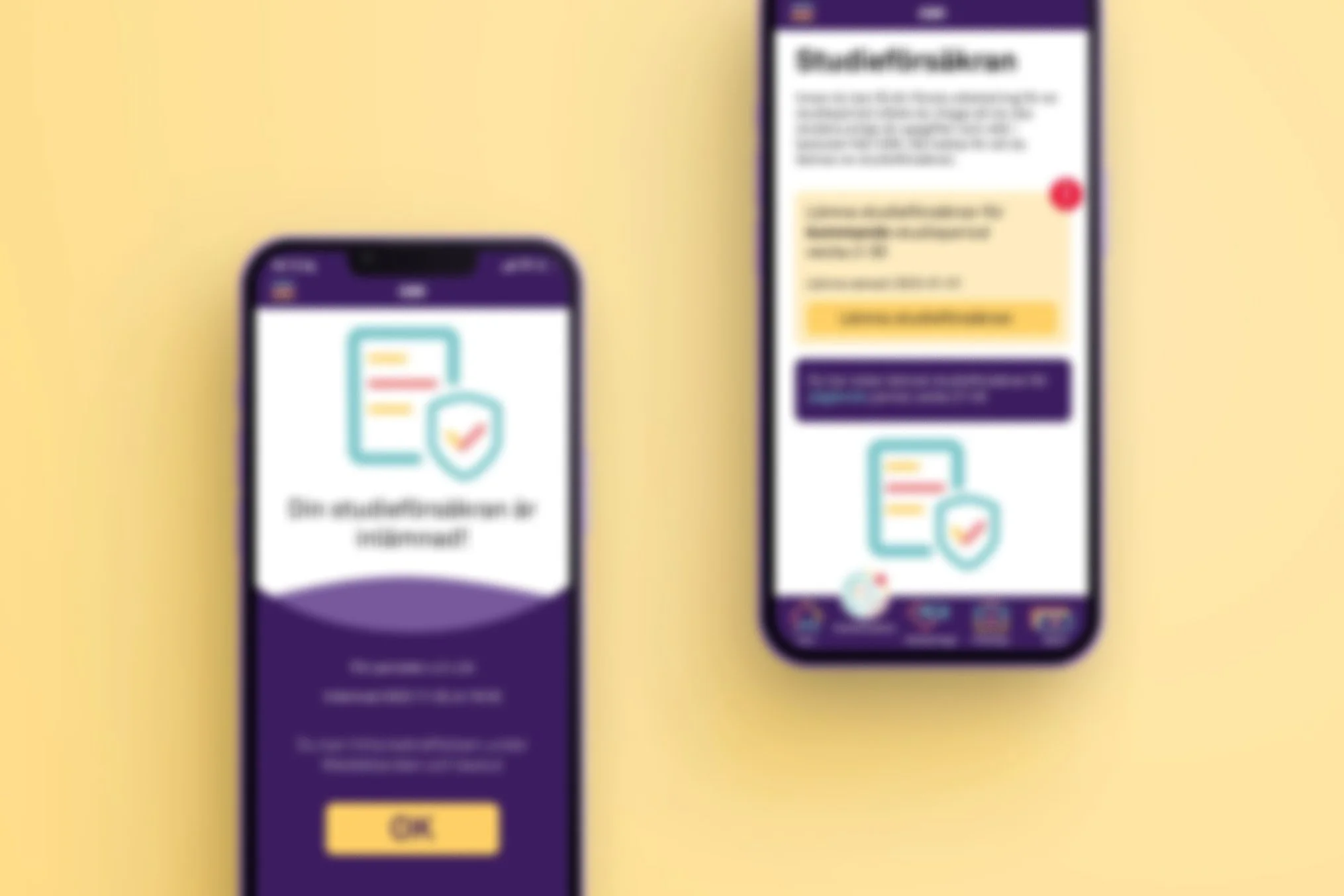
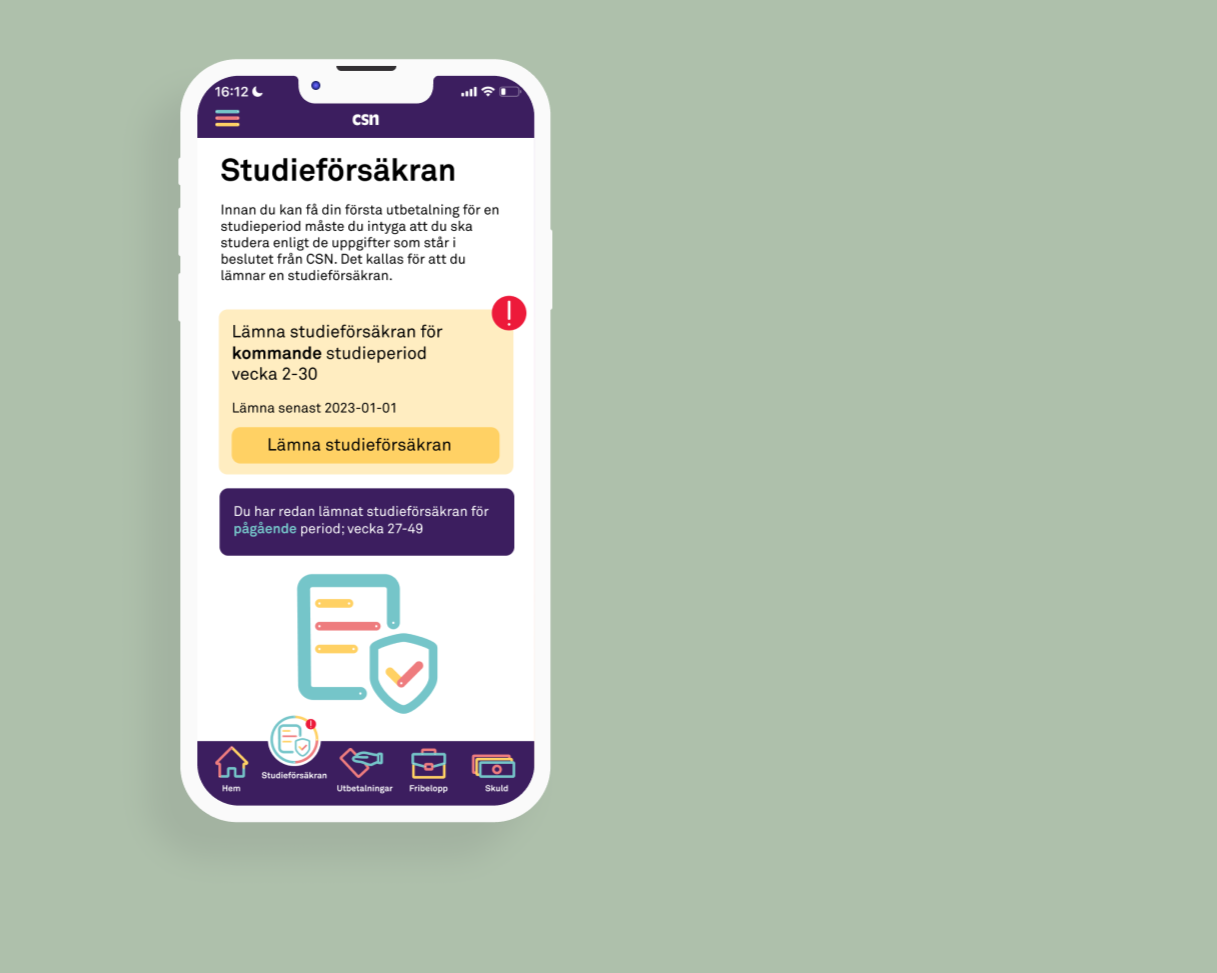
Redesign: Study assurance
On the study assurance tab, we have focused on enhancing feedback to the user. In the old app, users received feedback, but it lacked compatibility with other apps, and it wasn’t clear when it was time to submit the study certificate. We addressed this by applying signifiers in the form of exclamation marks both within the tab and in the bottom bar when a study certificate needs to be submitted. A confirmation page is displayed upon submission.

Redesign: FAQ
The FAQ section received a redesign, categorising the questions instead of simply listing them. This improved visual clarity and resulted in nearly a 50% reduction in time and clicks during user testing.
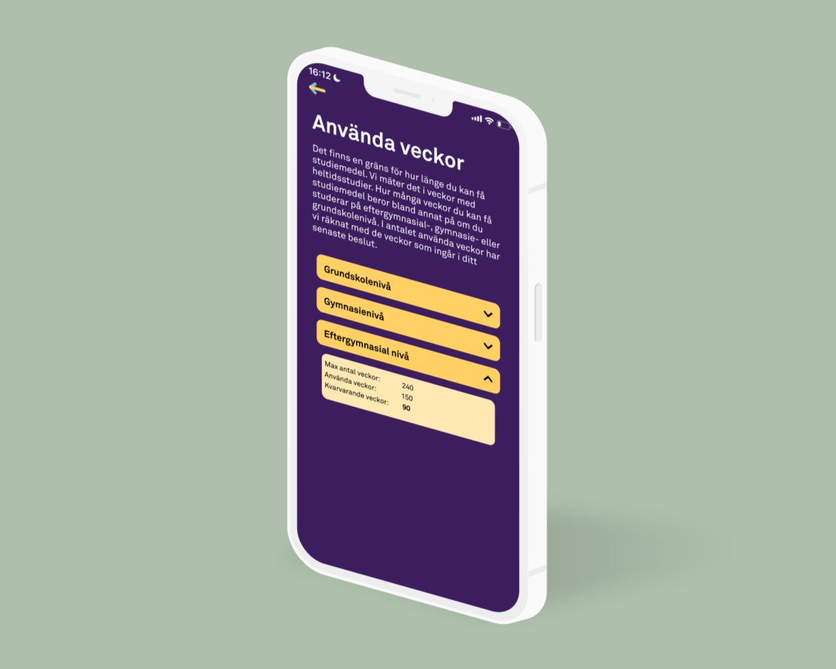
Redesign: Used weeks
The “used weeks” function is relocated to “my profile” based on findings from the first evaluation, which showed that only a few users accessed this function frequently. This aligns with the principle of prioritizing functions and information, as there was no reason for this feature to take up so much space in the app.
The project showed me the evident importance of user experience in combination with aesthetics. While the previous design shows signs of good UX, it fails heavily in upholding consistency for the organisation and thereby reduces trust. Finally, the users should be involved in every step of the way, from testing the old design, to the first, second and final iteration. An iterative process with user involvement almost certainly guarantees a successful outcome.
Since the finalisation of the project, many of the elements in our redesign can be identified in the current design of the CSN application
Aesthetics matter, and users should help deciding them!
- Usertester of the redesign
“Lovely colors, the symbols light up, well designed app in comparison to others in 2022”
- Usertester of the redesign